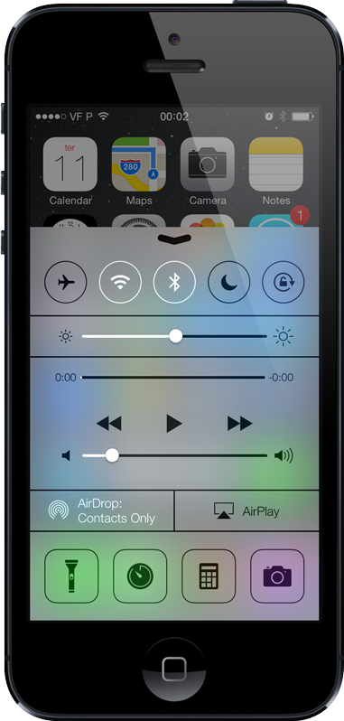
Today Apple announced their new iOS 7, which among other things includes a new strikingly flat UI design. Flat design has been around for a while now, making its way onto smartphone operating systems, desktop apps, and our webpages. And flat UI itself follows a trend that was already obvious in product design - that of hardware slabs, like the iPad, without obviously visible buttons.
Going flat, however, has its consequences. One of the most important consequences of flat design is that it blurs the line between what is content and what is interface. It puts pressure on typography and iconography, forcing them to now carry meaning that they previously might not have had. And because it forces so much onto icons and fonts, it also forces people to adapt to a new visual language, and rethink their usage patterns. This adaptation takes time.
Where you would look for subtle gradients that called for touch, you now must look for other hints. Perhaps highlights or colored nuances. And a language of flat design - an actual language, based on patterns and our collective learning - must emerge so that consumers can make new sense of things. We’re seeing the birth of new ways of showing (and interacting with) information.
With Apple being an inspiration to so many, it is easy to predict that we’ll see flat design everywhere soon. So as designers (of products, of hardware and of experiences), we need to be mindful about the issues that go with flat. Removing so many of the cues that represented the design of yesterday, we are forcing people to learn those that represent the design of today. The best designs (and the best designers) will be those that manage to stay up to date with the new trend while still respecting the user and his/her needs. Exciting - perhaps frustrating - times are ahead.